Content Module Recipe
The Content module is a ready-made /content screen for browsing and editing
any collection in your DaaS. Everything on it is driven by your schema: the
sidebar lists your collections, the list view picks its columns from the
collection’s fields, and the form renders the right interface for each field.
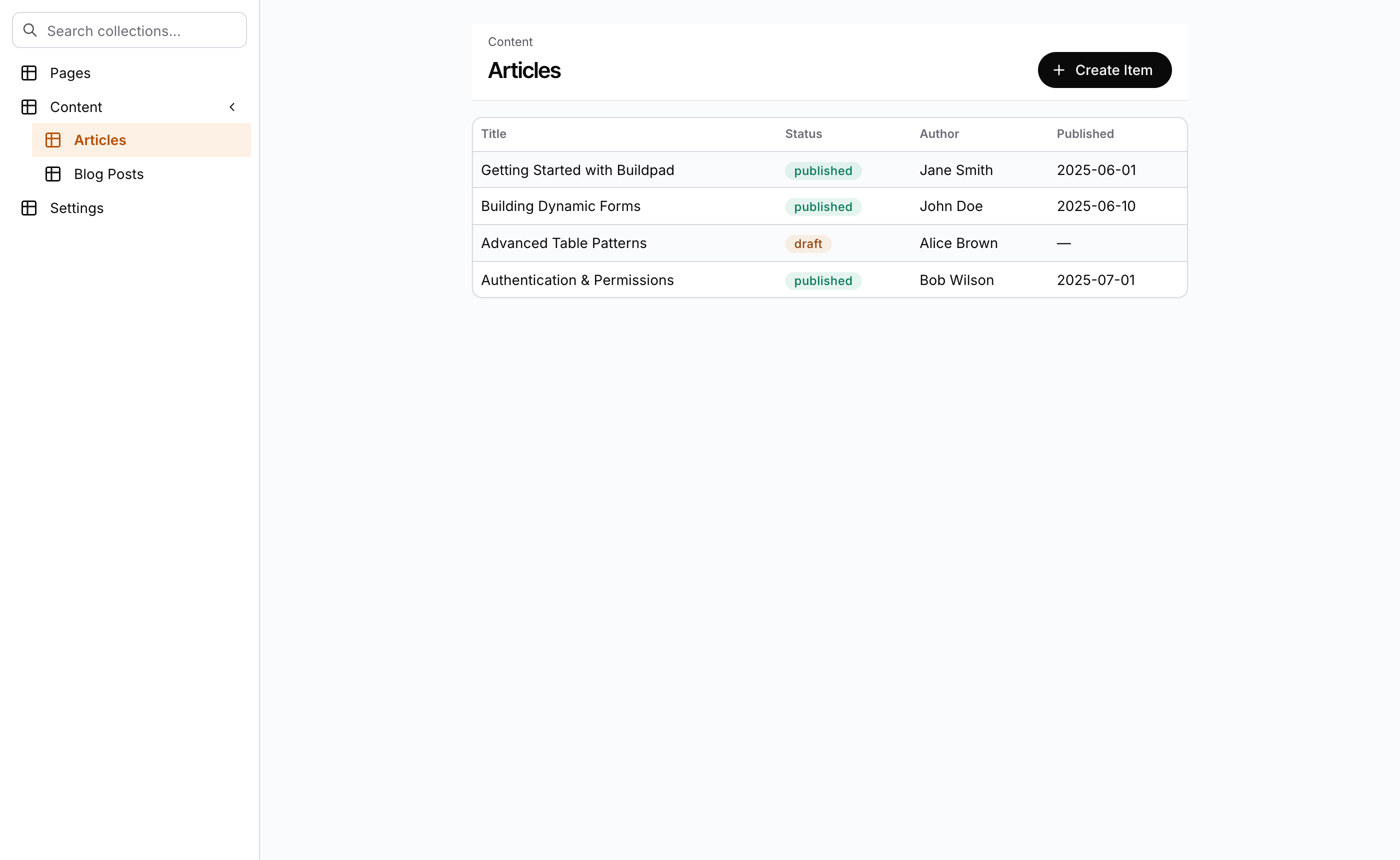
The Content module brings its own shell. ContentLayout draws the
collection sidebar and the header bar, so these pages do not render inside
the AuthenticatedShell that wraps your other pages.
The pieces
| Piece | Package | Role |
|---|---|---|
ContentLayout | @buildpad/ui-collections | The shell: AppShell with left sidebar, sticky header (title, breadcrumbs, actions), optional right detail panel |
ContentNavigation | @buildpad/ui-collections | The sidebar: collection tree with search, groups, bookmarks, hidden-collection toggle |
CollectionList | @buildpad/ui-collections | The list view: schema-aware table with search, filters, pagination, selection, bulk actions |
CollectionForm | @buildpad/ui-collections | The detail view: dynamic create/edit form rendering every field interface |
useCollections | @buildpad/hooks | Fetches the collection tree and manages group expand/collapse state |
Install
The module is opt-in: buildpad init does not add it.
buildpad add content-routesThis copies the four page files into app/[lang]/content/ and the
content-layout, content-navigation, collection-list, and collection-form
components into components/ui/. It also pulls in the api-routes and hooks
lib modules, so the proxy routes the pages call (/api/collections,
/api/fields/*, /api/items/*) come with it.
In a generated app the imports point at your local copies
(@/components/ui/content-layout, @/lib/buildpad/hooks). When you consume
the packages directly, import from @buildpad/ui-collections and
@buildpad/hooks instead.
The routes
Four files give you the whole module:
app/[lang]/content/
├── layout.tsx                  # shell: sidebar + header (wraps everything below)
├── page.tsx                    # index: redirects to the last-used collection
└── [collection]/
    ├── page.tsx                # list view
    └── [id]/page.tsx           # edit view ("+" id = create)
The code below is what content-routes generates, without the file header
comments.
The shell layout
app/[lang]/content/layout.tsx renders ContentLayout once for the whole module.
The sidebar is ContentNavigation fed by useCollections; the current
collection is read from the URL, so the active sidebar item follows routing.
CollectionsRelationalProvider lets relational fields (ListO2M, ListM2M,
ListM2A) open their create, select, and edit dialogs anywhere in the module.
"use client";

import React from 'react';
import { usePathname } from 'next/navigation';
import { useLocaleRouter } from '@/lib/i18n/navigation';
import { useI18n } from '@/lib/i18n/provider';
import { stripLocale } from '@/lib/i18n/config';
import { ContentLayout } from '@/components/ui/content-layout';
import { ContentNavigation } from '@/components/ui/content-navigation';
import { CollectionsRelationalProvider } from '@/components/ui/collection-form';
import { useCollections } from '@/lib/buildpad/hooks';

export default function ContentModuleLayout({
  children,
}: {
  children: React.ReactNode;
}) {
  const router = useLocaleRouter();
  const { t } = useI18n();
  const pathname = usePathname();

  // Extract current collection from URL: /[lang]/content/[collection]/...
  const segments = stripLocale(pathname).split('/');
  const currentCollection = segments.length > 2 ? segments[2] : undefined;

  const {
    rootCollections,
    activeGroups,
    toggleGroup,
    showHidden,
    setShowHidden,
    hasHiddenCollections,
    showSearch,
    dense,
    loading,
  } = useCollections({ currentCollection });

  return (
    <ContentLayout
      breadcrumbs={[{ label: t('app.content.breadcrumb'), href: router.href('/content') }]}
      sidebar={
        <ContentNavigation
          rootCollections={rootCollections}
          activeGroups={activeGroups}
          onToggleGroup={toggleGroup}
          currentCollection={currentCollection}
          onNavigate={(collection) => router.push(`/content/${collection}`)}
          showHidden={showHidden}
          onToggleHidden={() => setShowHidden(!showHidden)}
          hasHiddenCollections={hasHiddenCollections}
          showSearch={showSearch}
          dense={dense}
          loading={loading}
        />
      }
    >
      <CollectionsRelationalProvider>{children}</CollectionsRelationalProvider>
    </ContentLayout>
  );
}
useCollections turns on showSearch when there are more than 20 collections
and dense when there are more than 5.
The index page
app/[lang]/content/page.tsx renders nothing of its own. It redirects to the
collection the user opened last, or to the first collection when there is no
last one. With no collections at all, it shows an empty state.
The list view
app/[lang]/content/[collection]/page.tsx is CollectionList wired to the
router. Search, pagination, column controls, and the bordered card styling
are built in. The page also remembers the collection for the index redirect
and adds a bulk Delete action for the selected rows.
"use client";

import React, { use, useEffect } from 'react';
import { useLocaleRouter } from '@/lib/i18n/navigation';
import { useI18n } from '@/lib/i18n/provider';
import { IconTrash } from '@tabler/icons-react';
import { CollectionList } from '@/components/ui/collection-list';
import { useLocalStorage } from '@/lib/buildpad/hooks';
import type { BulkAction } from '@/components/ui/collection-list';

export default function CollectionPage({
  params,
}: {
  params: Promise<{ collection: string }>;
}) {
  const { collection } = use(params);
  const router = useLocaleRouter();
  const { t } = useI18n();
  const { setValue: setLastAccessed } = useLocalStorage<string>('last-accessed-collection');

  // Track last accessed collection
  useEffect(() => {
    setLastAccessed(collection);
  }, [collection, setLastAccessed]);

  const bulkActions: BulkAction[] = [
    {
      label: t('app.common.delete'),
      icon: <IconTrash size={16} />,
      color: 'red',
      action: async (selectedIds) => {
        if (!confirm(t('app.content.deleteConfirm', { count: selectedIds.length }))) return;
        try {
          await fetch(`/api/items/${collection}`, {
            method: 'DELETE',
            headers: { 'Content-Type': 'application/json' },
            body: JSON.stringify(selectedIds),
          });
          // CollectionList will auto-refresh
          window.location.reload();
        } catch (error) {
          console.error('Batch delete failed:', error);
        }
      },
    },
  ];

  return (
    <CollectionList
      collection={collection}
      enableSearch
      enableSelection
      bulkActions={bulkActions}
      onItemClick={(item) => router.push(`/content/${collection}/${item.id}`)}
    />
  );
}
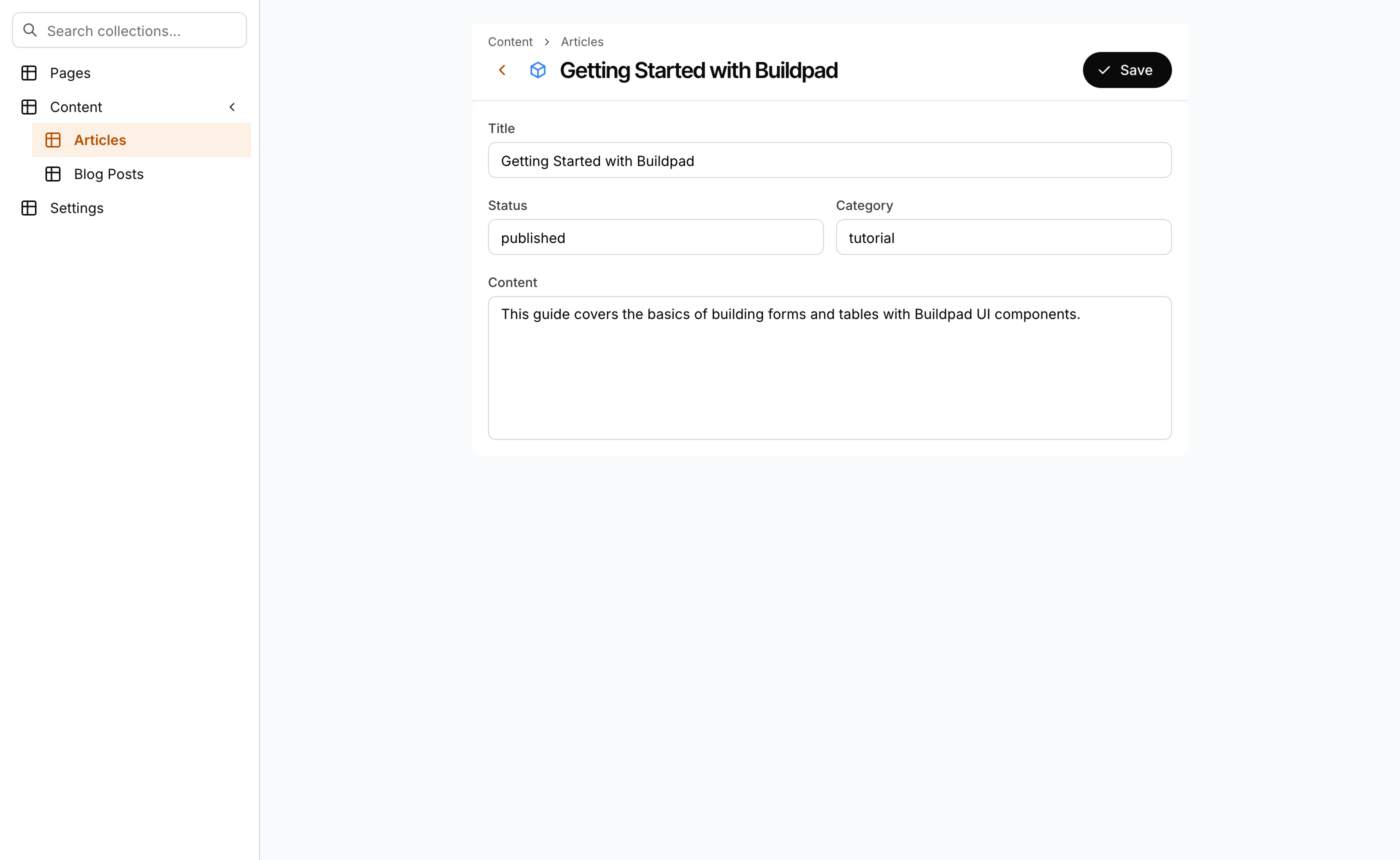
The edit view
app/[lang]/content/[collection]/[id]/page.tsx renders CollectionForm, which
wraps VForm with every field interface plus save/delete handling and
permission enforcement. The sentinel id + switches it to create mode
(isNewItem); any other id, new included, is an item’s key.
"use client";

import React, { use } from 'react';
import { useLocaleRouter } from '@/lib/i18n/navigation';
import { CollectionForm } from '@/components/ui/collection-form';
import { isNewItem } from '@/lib/buildpad/utils';

export default function ItemPage({
  params,
}: {
  params: Promise<{ collection: string; id: string }>;
}) {
  const { collection, id } = use(params);
  const router = useLocaleRouter();
  const isNew = isNewItem(id);

  return (
    <CollectionForm
      collection={collection}
      id={isNew ? undefined : id}
      mode={isNew ? 'create' : 'edit'}
      onSuccess={() => router.push(`/content/${collection}`)}
      onCancel={() => router.back()}
    />
  );
}
Customizing
ContentLayout props
The generated layout sets only breadcrumbs and sidebar. The other props
are there for your own pages inside the module:
| Prop | What it does |
|---|---|
title, icon, iconColor | The page title and the icon beside it |
breadcrumbs | The trail above the title |
actions | Buttons on the right of the header bar |
titleAppend | Content between the title and the actions |
headline | An area above the title, for example a version menu |
showBack, onBack | A back button before the title |
showHeaderShadow | The header shadow, for content that has scrolled |
sidebarDetail | A right-hand detail panel |
sidebarWidth, detailWidth | Sidebar widths in px (defaults 260 and 284) |
loading | Skeleton placeholders in the header |
CollectionList options
Useful props beyond the ones the generated page sets:
| Prop | What it does |
|---|---|
enableFilter | The inline filter panel |
fields | An explicit column list (default: the first 5 visible fields) |
filter | A fixed DaaS-style filter |
enableCreate, onCreate | The create (+) button and what it does |
enableDelete | Built-in delete with confirmation |
archiveField | Archive/unarchive UI for the named field |
tableSpacing | compact, cozy, or comfortable |
limit | Items per page |
Prerequisites
- A signed-in session. The pages call your DaaS through the proxy routes
that
api-routesadds, as the signed-in user. - The i18n setup from
buildpad init. The pages read their strings (app.content.*) and build locale-aware links throughlib/i18n. - No extra styling. The shell consumes the design tokens through the
Mantine theme: header and sidebar dividers use
--mantine-color-default-border, the sticky header elevates with--ds-shadow-mdon scroll, andCollectionListrenders as a bordered card. See the Styleguide for the token reference.
See the components live
Every state of the shell is in the Collections Storybook — ContentLayout
(list view, edit view, header shadow, detail sidebar, narrow sidebar,
loading) and ContentNavigation (bookmarks, dense, locked groups, non-admin,
empty). Run it locally with pnpm storybook:collections (port 6008) or
browse the deployed Collections Storybook.