App Shell
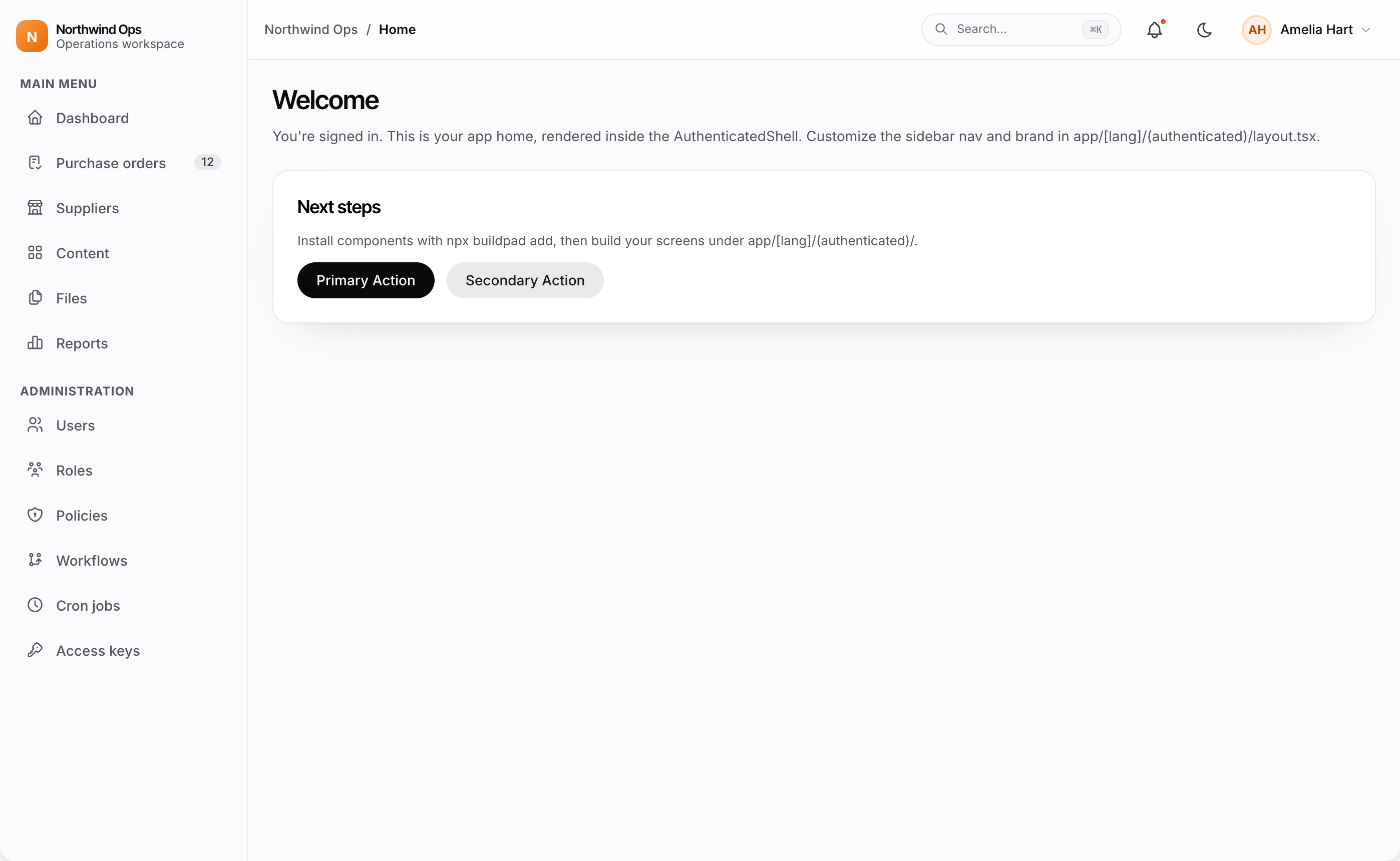
AuthenticatedShell is the app chrome around every signed-in page: a sidebar
with a brand mark and grouped navigation, and a glass-blur header with a
breadcrumb, optional search and notification affordances, and the account menu
at the top right. buildpad init wires it in for you, so your own pages (a
dashboard, a settings page, anything custom) render inside it out of the box.
Looking for a schema-driven screen to browse and edit your collections? That
is the Content Module Recipe. It brings its own shell,
ContentLayout.
What generates it
| File | What it holds | Written by |
|---|---|---|
components/layout/AuthenticatedShell.tsx | The shell component | buildpad init (design-system module) |
components/layout/navigation.ts | The sidebar entries (NAV_ITEMS) | buildpad init (design-system module) |
app/globals.css | The shell styles, under the .bp-* namespace | buildpad init (design-system module) |
app/[lang]/(authenticated)/layout.tsx | The layout that wraps every page in the route group with the shell | buildpad add api-routes |
The styles are built entirely from design tokens, so light and dark mode come for free.
The generated layout
The layout renders the shell with defaults: the entries in
navigation.ts and the NEXT_PUBLIC_APP_NAME brand. It also provides the DaaS
connection and CollectionsRelationalProvider to every page inside it.
import { DaaSProviderWrapper } from "@/components/DaaSProviderWrapper";
import { AuthenticatedShell } from "@/components/layout/AuthenticatedShell";
import { CollectionsRelationalProvider } from "@/components/ui/collections-relational-provider";
import type { ReactNode } from "react";

export default function AuthenticatedLayout({
  children,
}: Readonly<{ children: ReactNode }>) {
  return (
    <DaaSProviderWrapper>
      <CollectionsRelationalProvider>
        <AuthenticatedShell>{children}</AuthenticatedShell>
      </CollectionsRelationalProvider>
    </DaaSProviderWrapper>
  );
}
Put your own pages under app/[lang]/(authenticated)/ and they render inside
the shell.
Customizing the navigation & brand
Edit the sidebar entries
The sidebar entries live in components/layout/navigation.ts, and the shell
uses its NAV_ITEMS export by default. Edit it freely: add, remove, or reorder
entries. The active entry also sets the header breadcrumb label.
Entries can carry an optional section. The sidebar groups entries under
labelled headings: entries without a section go under Main Menu, and
groups appear in the order of their first entry.
export const NAV_ITEMS: NavItem[] = [
  { label: "Home", labelKey: "app.nav.home", href: "/", icon: IconHome },
  { label: "Users", href: "/users", icon: IconUsers, section: "Administration" },
  { label: "Roles", href: "/roles", icon: IconUsersGroup, section: "Administration" },
  // buildpad:nav-insert — installed route modules add entries above this line. Do not remove.
];
Write href without a locale prefix; the shell adds the active locale.
labelKey and sectionKey are optional dictionary paths in lib/i18n, and
label and section are the fallbacks when a key is missing.
How route modules add entries
When you install a route module (buildpad add users-routes, files-routes,
forms-routes, workflows-routes, cron-routes), the CLI appends that
module’s entries above the buildpad:nav-insert marker. Entries are matched by
href, so re-runs never duplicate them and your ordering and edits stay.
If the marker is missing (older design-system copies, custom shells), the CLI
prints the entries for you to add manually. buildpad upgrade --design brings
in the managed file and seeds it with the entries of the route modules you
already have installed. The file is adopt-once: upgrades create it when it is
missing but never overwrite it, so removals and reordering are always respected.
Set a custom brand or nav
To set a custom brand, or to replace the nav wholesale through the navItems
prop, you can’t pass them straight from the layout. The layout is a Server
Component, and Tabler icons are components, which can’t cross the
server/client boundary. Put the config in a small "use client" wrapper and
render that from the layout instead:
"use client";

import { AuthenticatedShell } from '@/components/layout/AuthenticatedShell';
import { IconHome, IconLayoutDashboard } from '@tabler/icons-react';
import type { ReactNode } from 'react';

const NAV_ITEMS = [
  { label: 'Home', href: '/', icon: IconHome },
  { label: 'Dashboard', href: '/dashboard', icon: IconLayoutDashboard },
];

export function PortalShell({ children }: { children: ReactNode }) {
  return (
    <AuthenticatedShell navItems={NAV_ITEMS} brand={{ name: 'Acme', initial: 'A' }}>
      {children}
    </AuthenticatedShell>
  );
}import { DaaSProviderWrapper } from '@/components/DaaSProviderWrapper';
import { CollectionsRelationalProvider } from '@/components/ui/collections-relational-provider';
import { PortalShell } from '@/components/PortalShell';
import type { ReactNode } from 'react';
export default function AuthenticatedLayout({
children,
}: Readonly<{ children: ReactNode }>) {
return (
<DaaSProviderWrapper>
<CollectionsRelationalProvider>
<PortalShell>{children}</PortalShell>
</CollectionsRelationalProvider>
</DaaSProviderWrapper>
);
}Props
| Prop | Default | What it does |
|---|---|---|
navItems | NAV_ITEMS from components/layout/navigation.ts | The sidebar entries |
brand | NEXT_PUBLIC_APP_NAME (or “Buildpad”) | The brand mark letter and name: { name, initial } |
showSearch | true | The header search affordance (presentational; wire it to your own search) |
showNotifications | true | The header notification bell (presentational) |
showLanguageSwitcher | true | The LanguageSwitcher in the header; renders nothing with a single locale |
headerActions | — | Extra controls in the header, before the language switcher and theme toggle |
Upgrades
The shell ships as part of the tracked
design-system module, so
buildpad upgrade --design keeps the component and its .bp-* styles current.
upgrade refreshes the component file only. Your layout wiring and nav
config are your code, and it never rewrites them.
Pick one shell per route subtree. Don’t wrap AuthenticatedShell around
/content/*: the Content module already renders ContentLayout,
and you’d get duplicate sidebars and headers.
See it live
The App shell template in the Styleguide shows the shell with the generated home page, the header and sidebar anatomy, the account menu, and the phone layout, in light and dark mode.